 "Maxima Speed" (maximaspeed)
06/15/2018 at 16:43 • Filed to: I payed for this!?, College life
 0
0
 8
8|
"Maxima Speed" (maximaspeed)
06/15/2018 at 16:43 • Filed to: I payed for this!?, College life | 0
| 8 |
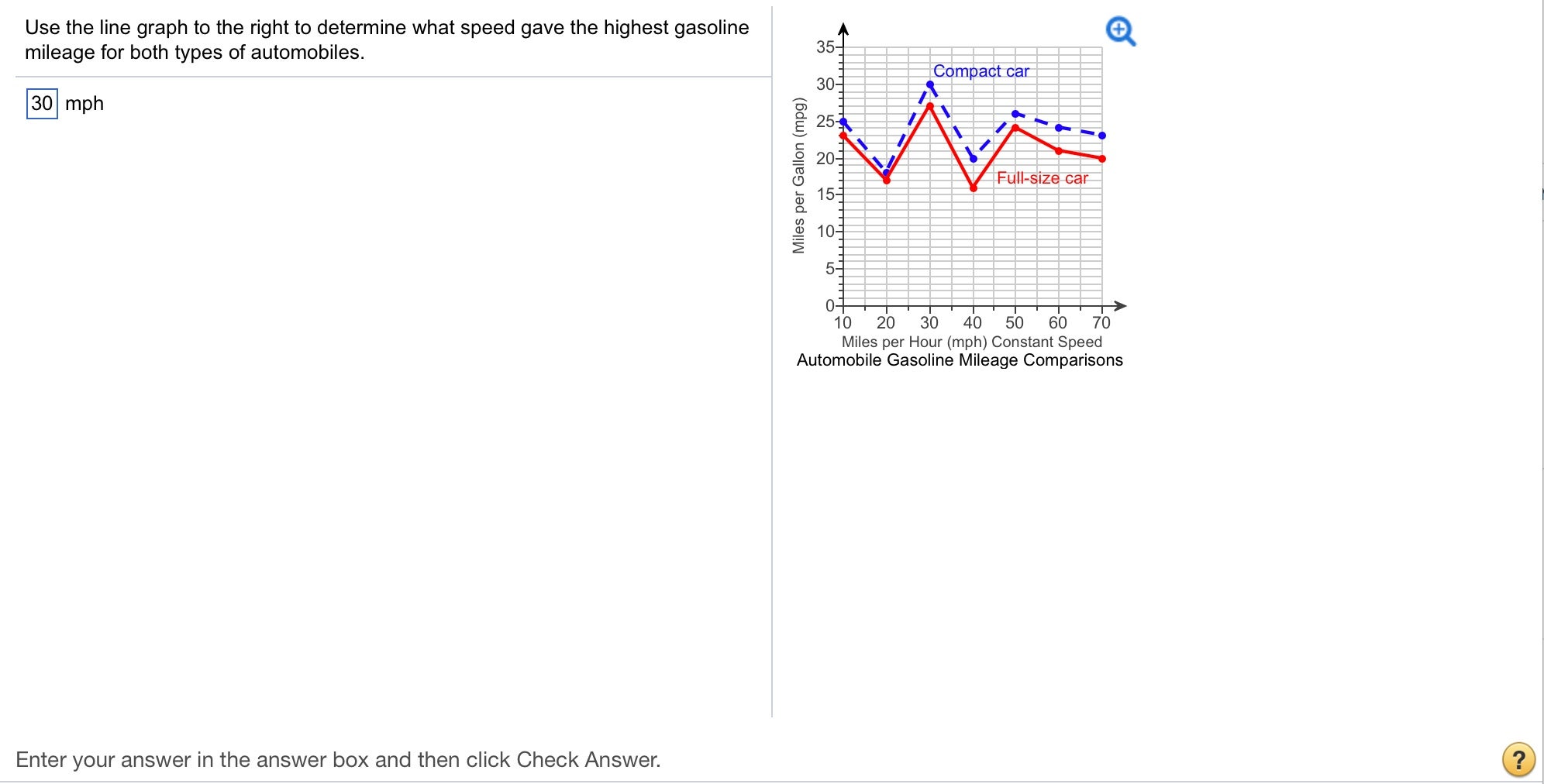
Im confused about how many gears these hypothetical cars have to create the shown peaks and valleys, and why they are so poorly designed. My guess is 1980's GM. Also how does one get 25 mpg’s when stationary? So many questions.
 MrDakka
> Maxima Speed
MrDakka
> Maxima Speed
06/15/2018 at 16:51 |
|
Its 25mpg at 10 mph. The x axis starts at 10 mph
|
Maxima Speed
> MrDakka
06/15/2018 at 16:53 |
|
Oh, yeah :P *derp
 lone_liberal
> Maxima Speed
lone_liberal
> Maxima Speed
06/15/2018 at 16:55 |
|
Ah, but the graph starts at 10mph, so that’s first gear. Every positive inflection point should be a shift, correct? So I’m counting 3, or maybe 4 gears. Four speed automatic checks with 1980s GM.
 Tekamul
> Maxima Speed
Tekamul
> Maxima Speed
06/15/2018 at 16:56 |
|
Proof positive school zones are a conspiracy formulated by big oil.
 Akio Ohtori - RIP Oppo
> lone_liberal
Akio Ohtori - RIP Oppo
> lone_liberal
06/15/2018 at 16:57 |
|
4-speed? Isn’t that awfully optimistic for 80s GM?
 RamblinRover Luxury-Yacht
> Maxima Speed
RamblinRover Luxury-Yacht
> Maxima Speed
06/15/2018 at 16:57 |
|
I had to write code to generate just such a plot, once. The source car was a ‘96 Taurus.
|
Akio Ohtori - RIP Oppo
> Maxima Speed
06/15/2018 at 16:58 |
|
Ok I agree this is a bad chart but it also sort of jives with my experience. I get stellar gas mileage in my Discovery when overlanding, which is at about 30mph average. Easily get 2 MPG over highway mileage.
|
lone_liberal
> Akio Ohtori - RIP Oppo
06/15/2018 at 16:59 |
|
The th700r4 came out in the early 80s so it was probably pretty widespread by the end of the decade. I don’t know about their FWD transmissions, though.